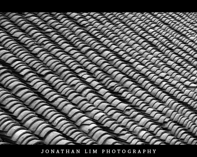
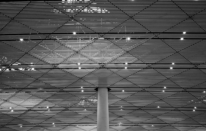
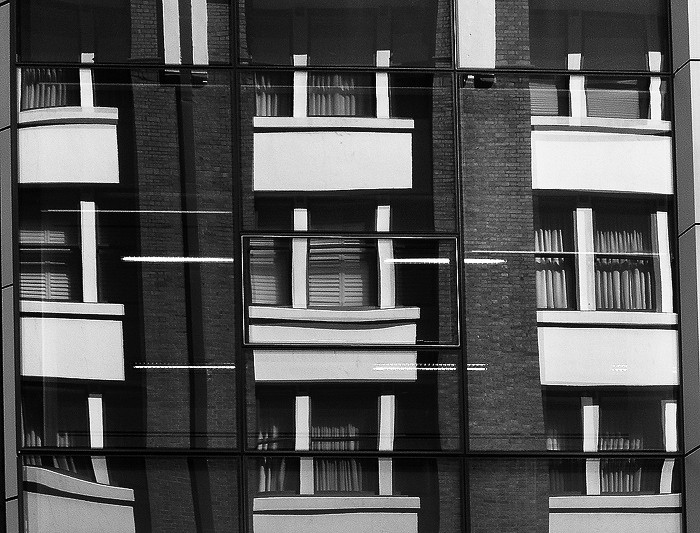
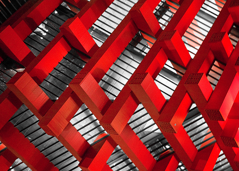
I have ordered my artworks meticulously so that the series flows well from each photograph.
In the first two photographs, the use of patterns, lines and shapes (second piece) is the standpoint of each piece. In relation to the theme of manhood, both of these photos signify a trend that we see so often not only in our society but throughout history, where men follow the pack and simply blend into the status quo.
The third photograph is a glass building that is reflecting an adjacent building. I love the illusion created in this photograph, many people will just look at and think that it is just a single building. This photograph was added into the collection to represent how males change themselves to represent what is accepted of their society or environment at the time. In a metaphorical sense, the glass building is the man's true image but he reflects the other building that is deemed to be the most superior and accepted.
In the next photo, all the colours have been desaturated except for the colour red. This photograph has a very rigid line structure, strong bold diagonal lines, which are emphasized through the colour red. This photograph depicts males during times of war. Looking back at historical events such as the Cold War, men had to emotionless and tough this is represented through the powerful use of lines and the colour red - that symbolizes warfare (blood etc.).
The following photo, filled with intricate patterns and shapes represents the transition / the change of the image of males. This is shown through the curve line structures that still have rigid patterns within them (the triangles and squares.
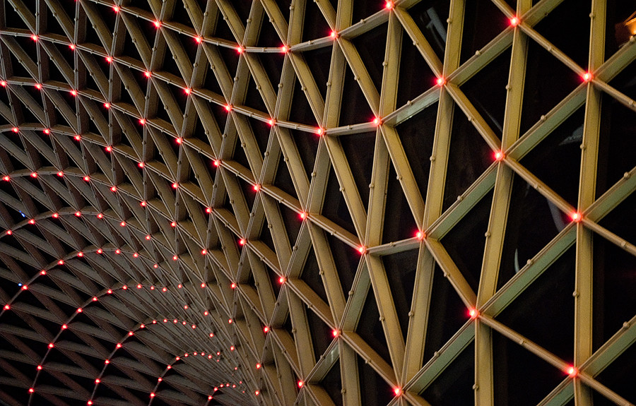
The sixth photograph is a shot in the Myer's Center in Brisbane, it's a shot of the roof. This photograph simply portrays how males are allowed to express their emotions, both dark and feminine in our society today. This is signified through the use of curved lines and curved shapes. Personally, I love this piece. It's very intricate and eye catching. The lighting, the texture really compliment the shapes and line structure of the piece.
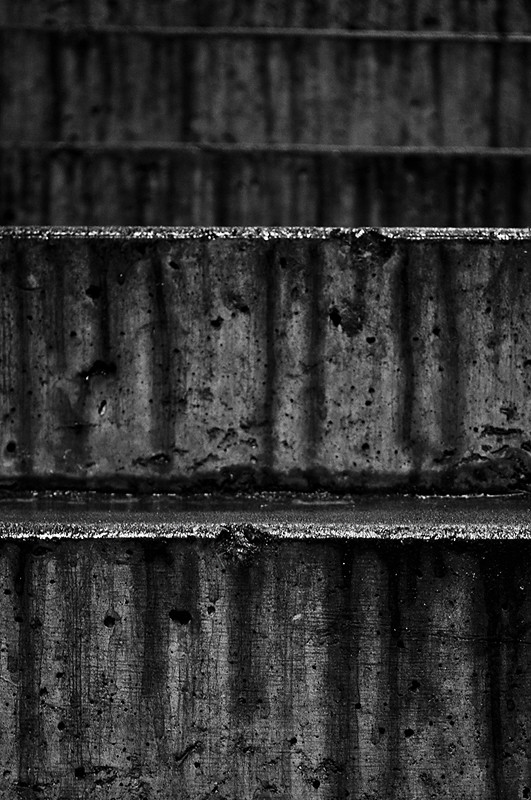
In the 7th photograph, it represents the mental pain of males. Where they bottle up their emotions. Their emotions begin to permanently scar them. The dripping texture within the photograph signifies tears.
In the eighth and ninth photograph, there are line structures and shapes created from simple everyday objects and environments. These following shots were taken at school. The various line structures represents the complexity of men.
The final piece simply closes the series, the circular shape compliments and contrasts with all the other pieces displayed in the series.
Monday, May 23, 2011
Sunday, May 22, 2011
My Body of Work: The Lining of Man

The Lining of Men
The following series of photographs entitled The Lining of Men reflects my personal interpretation of different aspects and trends of manhood. My personal perception of manhood is displayed through the series by the metaphorical use of line structures, patterns and symbolic colours. This series of photographs is inspired by a number of photostreams on flickr by online photographers such as Kai Schwarzer and Jeremy J, whom both have a very intricate eye for alternate views and interesting patterns, textures and colours.
In the series of the photographs, the rhythm and emphasis on different line structures varies to represent the perception of man in different times of society and other elements of males.
In the series of the photographs, the rhythm and emphasis on different line structures varies to represent the perception of man in different times of society and other elements of males.
An older piece
Looking back at my personal photo blog, I found another artwork that expressed interesting use of curved lines. Here's the photo in it's raw state.
The exif data for this shot is as follows:
- Nikon D3000
- 1/400 Seconds
- f/5.6
- 55mm (Using 18-55 VR 3.5-5.6/f, VR on)
- 400 ISO
- 0EV
The majority of this artwork was processed through lightroom, therefore providing a .PSD file would be useless so I'll just put down in the highest detail of what I did to this photo.
Adobe Lightroom 2.5
1. Rotated 90 degrees clockwise.
2. It was then cropped heavily rendering the photograph to curved lines.
3. Exposure decreased to -0.38
4. Recovery increased to +100
5. Fill light increased to +100
6. Blacks increased to +56
7. Brightness and contrast increased. +50 and +100.
8. Clarity and vibrance both increased to +100.
9. Saturation decreased to -69.
10. Blues and purples were desaturated using selective colour tool.
11. Curves was adjusted to 'Medium Contrast' setting.
12. Luminance Smoothing was carried out to reduce the amount noise.
13. Vignette was added
14. The photograph was sharpened, using a masking technique. For more information: Click here
15. The camera profile (affects the colours) was set to 'D2X Mode 3'
16. Calibration Red Hue was increased by +10.
Adobe Photoshop CS3
1. Resized
2. Desaturated colours by -6
3. Increased contrast.
4. Added emerald photo filter at 25%. The layer opacity was then reduced to 38%.
2. Desaturated colours by -6
3. Increased contrast.
4. Added emerald photo filter at 25%. The layer opacity was then reduced to 38%.
5. Added text on the corner of the piece.
The following outcome is as follows:
Friday, May 20, 2011
Reflection II
At this point of my work, I believe that I have made and found a suitable amount of photographs that will be able to make my photographic series that depicts my personal perception of manhood.
I need to shortlist what photographs are needed, and what are the main artworks. Whilst doing this I will eliminate photographs that do not fit the overall theme of my body of work - patterns, lines and colours.
I discussed with my Visual Arts teacher, Mr Lane, on the number of artworks that can be included into my set. His response to this that I was allowed to present as many as would like.
--
Decision Making.
Referring to the photographs in the following post : http://8th-atomos.blogspot.com/2011/05/browsing-through-old-photographs.html
Through discussion with my teacher and personal reflection, I have decided to use all of the pictures in that post with the exception of this piece (Shown below)
The reason for this is that is really didn't have an organized pattern or line structure. As well as that, it kinda of had a different theme, the other photographs in the post are very realistic however in this shot it feel fictional. It looks like a fractal.
--
Overall: I have decided to use all the other photographs.
What to do now: I need to make sense of my artworks, begin linking the artistic elements to the theme of manhood.
--
LIST OF CURRENT WORKS
- http://www.flickr.com/photos/glimjo/5130896335/
- http://www.flickr.com/photos/glimjo/5104837562/
- http://www.flickr.com/photos/glimjo/5104242593/
- http://www.flickr.com/photos/glimjo/5058976915/
- http://www.flickr.com/photos/glimjo/4883903569/
- http://www.flickr.com/photos/glimjo/5722212110/in/set-72157626632835191
- http://www.flickr.com/photos/glimjo/5721379249/in/set-72157626632835191
- http://www.flickr.com/photos/glimjo/5721937664/in/set-72157626632835191
- http://www.flickr.com/photos/glimjo/5721523816/in/set-72157626632835191
Sunday, May 15, 2011
More interesting photographs. (Inspiration)
The following photos are from flickr. By CocoGogol and The New No. 2.


Post-Processing of three shots.
The shots that I have chosen are selected from the following list of shots:
http://imageshack.us/f/849/unled1bf.jpg/
153, 175+176 and 181.
--
153.
The photograph was shot in the following settings: NEF+JPG (Fine)
Adobe Lightroom 2.5
1. Cropped image modelled using the rules of thirds.
2. Convert grayscale
3. Increased clarity and contrast
4. Increased fill light and black clipping.
Adobe Photoshop CS3
At this point, the image was basically finished, no further processing was needed except for the general items such as sharpening and resizing.
1. Sharpened using high pass filter.
2. Added border.
The final result is as shown below.
--
175 and 176.
175 is to the left and 176 to the right.
I decided to use the 176.
Adobe Photoshop CS5
1. Auto-tone, auto-contrast and auto-colour.
2. Shadow/Highlights
I experimented with this piece by taking the central pole from 176 and applying it to 175, making the entire image in focus and sharp. However, I did not turn to my liking. Image shown below.
3. Black and white conversion.
4. Brightness and contrast
5. High Pass Filter
The finished product is shown below.
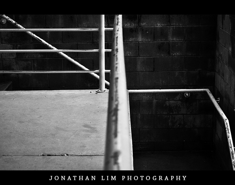
My favourite part of this piece is the rhythm and line structures that it contains. It's filled with simple linear lines that direct the viewer through out the entire piece. The texture of the bricks also adds more tactility and compliments the bottom left of the piece through contrast in textures.
--
181
This photograph was edited during class time.
Adobe Photoshop CS5
1. Cloned out the stick in the top right (Red outline in before image)
2. Highpass sharpen
3. Curves, increased lights and darks. (0, +54)
4. Brightness and contrast layer
5. Converted to Greyscale
5. Added borders and logo
http://imageshack.us/f/849/unled1bf.jpg/
153, 175+176 and 181.
--
153.
The photograph was shot in the following settings: NEF+JPG (Fine)
The exif data for this shot is as follows:
- Nikon D90
- 1/20 Seconds
- f/5.6
- 55mm (Using 18-55 VR 3.5-5.6/f, VR on)
- 400 ISO
- -1EV
Adobe Lightroom 2.5
1. Cropped image modelled using the rules of thirds.
2. Convert grayscale
3. Increased clarity and contrast
4. Increased fill light and black clipping.
Adobe Photoshop CS3
At this point, the image was basically finished, no further processing was needed except for the general items such as sharpening and resizing.
1. Sharpened using high pass filter.
2. Added border.
The final result is as shown below.
Overall, I liked this work very much. I feel that the grungy like texture of the stairs gives the shot lots of appeal. A depth of field has been added to my photograph through the use of zoom, creating bokeh in the unfocussed areas.
175 and 176.
175 is to the left and 176 to the right.
I decided to use the 176.
Adobe Photoshop CS5
1. Auto-tone, auto-contrast and auto-colour.
2. Shadow/Highlights
I experimented with this piece by taking the central pole from 176 and applying it to 175, making the entire image in focus and sharp. However, I did not turn to my liking. Image shown below.
3. Black and white conversion.
4. Brightness and contrast
5. High Pass Filter
The finished product is shown below.
My favourite part of this piece is the rhythm and line structures that it contains. It's filled with simple linear lines that direct the viewer through out the entire piece. The texture of the bricks also adds more tactility and compliments the bottom left of the piece through contrast in textures.
--
181
This photograph was edited during class time.
Adobe Photoshop CS5
1. Cloned out the stick in the top right (Red outline in before image)
2. Highpass sharpen
3. Curves, increased lights and darks. (0, +54)
4. Brightness and contrast layer
5. Converted to Greyscale
5. Added borders and logo
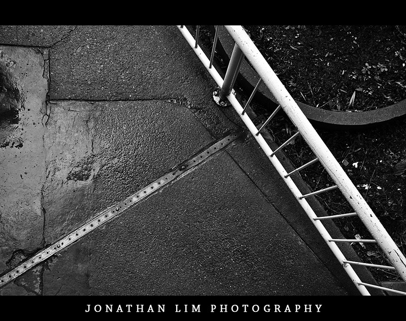
In addition to the line structure and shapes seen in this photograph, I felt that the weather that I shot this photograph gives the photo 'edge.' The main artistic element that can be seen in this photograph, is the alternative views of lines and shapes. From the bright lines created from the fence to the circle shape created on the top right corner. If one looks deeper into this piece, they can see the line structures from the cracks on the floor. Look at the top left corner, the cracks goes from the top of the piece to the bottom, there's even a rectangular shape created on the left side of piece.
This photographs shows that even in common places in ours lives, there are intricate line structures that surround us.
This photographs shows that even in common places in ours lives, there are intricate line structures that surround us.
Browsing through old photographs.
Today I was browsing through my flickr account looking for photographs that had either of the following: strong patterns, strong colours and strong line structure.
A list of photographs that I've found are shown below:
A list of photographs that I've found are shown below:
- http://www.flickr.com/photos/glimjo/5130896335/
- http://www.flickr.com/photos/glimjo/5104837562/
- http://www.flickr.com/photos/glimjo/5104242593/
- http://www.flickr.com/photos/glimjo/5085584787/
- http://www.flickr.com/photos/glimjo/4883903569/
- http://www.flickr.com/photos/glimjo/5058976915/
I feel that this selection of photographs are of very high quality both in fitting the theme of my body of work and in general display of artistic skills.
Reflection
I'm looking to have around six photographs in my body of work.
These photographs will be a mixture of new photographs I've taken during class time and previous photographs that I've taken. Despite being taken at different times, they will both focus on patterns, shapes and colours.
These photographs will be a mixture of new photographs I've taken during class time and previous photographs that I've taken. Despite being taken at different times, they will both focus on patterns, shapes and colours.
Photoshoot II
Line Structures
"Literal lines do not exist in nature, but are the optical phenomena created when objects curve away from the viewer. Nonetheless, line-like shapes are for all intents considered line elements by the artist; for example, telephone and power cables or rigging on boats. Any such elements can be of dramatic use in the composition of the image. Additionally, less obvious lines can be created, intentionally or not, which influence the direction of the viewer's gaze. These could be the borders of areas of differing color or contrast, or sequences of discrete elements, or the artist may exaggerate or create lines perhaps as part of his style, for this purpose. Many lines without a clear subject point suggest chaos in the image and may conflict with the mood the artist is trying to evoke.
Movement is also a source of line, and blur can also create a reaction. Subject lines by means of illusion contribute to both mood and linear perspective, giving the illusion of depth. Oblique lines convey a sense of movement and angular lines generally convey a sense of dynamism and possibly tension. Lines can also direct attention towards the main subject of picture, or contribute to organization by dividing it into compartments."
More examples of interesting artworks with powerful line structures. By tina negus, mluisa and Gremxul respectively.


Ring II
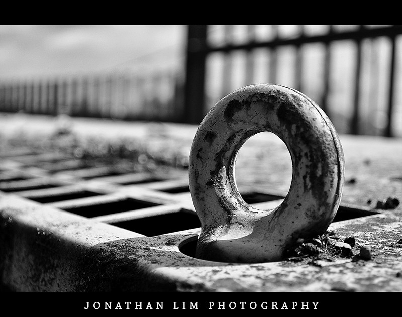
Through the use of wide aperture and zoom of 45mm I was able to create enough blur to isolate the circular geometric shape.
Appeal is created through this photo by the circle shape, along with the harsh shadows and contrast the compliment the shape.
The use of black and white was to remove the element of colours, leaving one less element for one to to take in whilst looking at this work. With BW, the texture is more prominent.
This photo represents the acceptance of males to express themselves, this is show through the use of geometric shape. The circle. However, masculinity is still prominent through the rough textures.
Overall, I like this photograph a lot. It has a strong texture and contrast. It's a alternative view to an common object.
Ring
Post-Processing
Using the photographs from my shortlist- which can be seen in the post below - I have started to edit them through the use of the following adobe programs: Lightroom 2.5 and Photoshop CS3.
This photograph was shot with the D90 in the following camera settings:
This photograph was shot with the D90 in the following camera settings:
The exif data for this shot is as follows:
- Nikon D90
- 1/800 Seconds
- f/5.6
- 45mm (Using 18-55 VR 3.5-5.6/f, VR on)
- 200 ISO
- 0EV
--
Adobe Lightroom 2.5
1. Converted to black and white.
2. Increase contrast through the use of curves; increase lights, decrease darks.
3. Increase clarity.
4. Fill lights and black increased.
Adobe Photoshop CS3
1. Sharpened through High pass filter layer set to Overlay with decreased opacity.
2. Added borders and logo.
The finish product is shown below.
After playing around with the second image on Lightroom.. I decided that i wasn't strong enough picture
Subscribe to:
Comments (Atom)
