Overall, I felt that the whole set works very stongly.
The final print outs weren't as I expected, with the colours prints being very dark and contrasty. It just didn't loo good.
That is why I would prefer presenting the artworks, maybe on a High Def lcd monitor. So that all colours can be shown without alteration.
I thought that the strongest work in the set was my last piece Stop Start End.
All in all, I believe that I created a good artistic portrayal of the Chinese workforce daily routine in relation to transportation.
Jonathan Lim
Monday, November 22, 2010
Stop Start Ending III
Stop Start Ending
By Jonathan Lim.
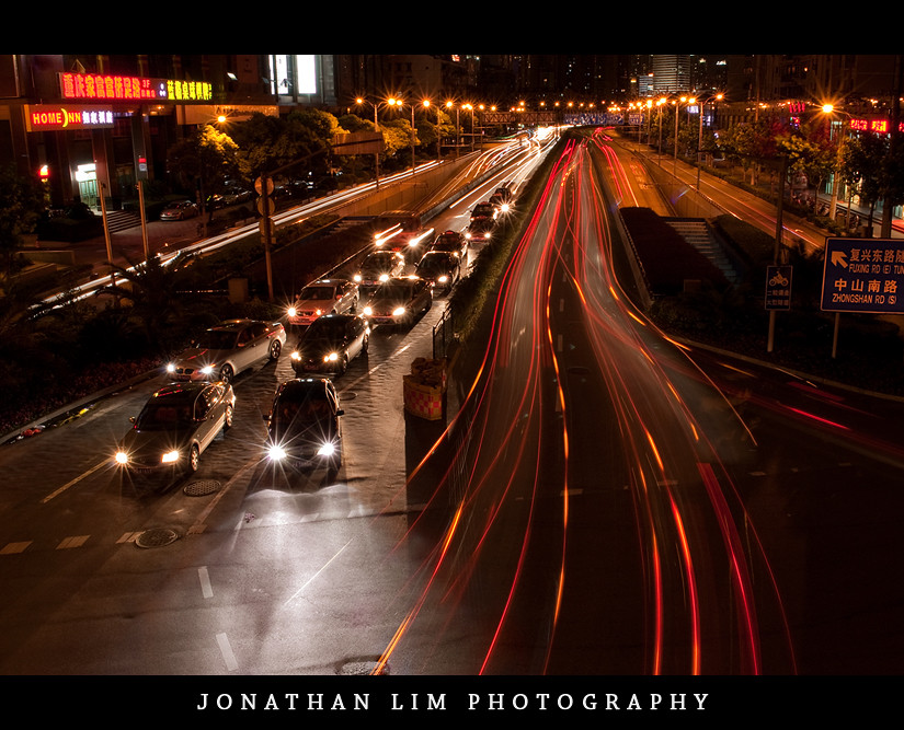
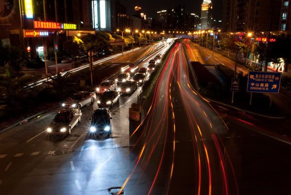
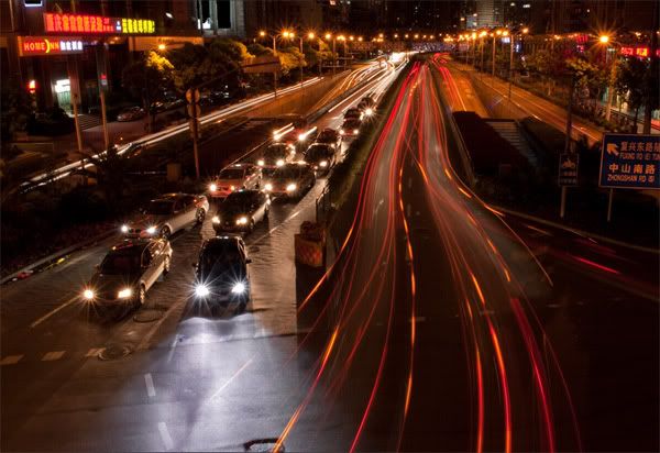
A long exposure photograph which shows both stillness and movement.
--
I personally love the composition of this photo. Through the stationary cars on the left and the light streams to the right it creates great rhythym. Directing ones up and down the piece, one could even call this a cycle.
I believe that this photograph is the strongest in the set Cycles.
I would love to continue this style of photography that involves the constant use of long exposures.
Stop Start Ending II
When I was over at Shanghai, there was bridge outside my hotel which towered over a busy intersection. So I decided to take a number of long exposure photographs using my tripod. I wanted to create a photograph which was different from other traffic long exposure shots.
Here's a screenshot of some of the shots taken.
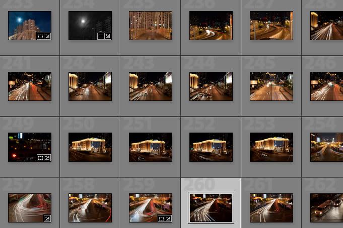
From here I chose the following RAW shot below. I liked this shot because it was different to the other shots that I took on that night. It displays both stillness and movement, thus creating an interesting composition.
--
Adobe Lightroom 2.5
1. Cropped the image + straightned
2. Decreased the saturation of the blues in photoshop
3. Increased highlight recovery
4. Increased the vibrancy
5. Increased the fill light whilst decreasing the exposure
6. Change the colour balance, making the image much warmer.
After the edits in Lightroom the image now looked like this:

Here's a screenshot of some of the shots taken.

From here I chose the following RAW shot below. I liked this shot because it was different to the other shots that I took on that night. It displays both stillness and movement, thus creating an interesting composition.

As much as already did love this photo, I felt that it could be improved. The blue lights imo were very distracting and disrupted the whole ambience of the photograph.
EXIF DATA:
Nikon D3000
15 Seconds
f/20
18mm (Using 18-55 VR 3.5-5.6/f, VR off)
100 ISO
0EV
EXIF DATA:
Nikon D3000
15 Seconds
f/20
18mm (Using 18-55 VR 3.5-5.6/f, VR off)
100 ISO
0EV
--
Adobe Lightroom 2.5
1. Cropped the image + straightned
2. Decreased the saturation of the blues in photoshop
3. Increased highlight recovery
4. Increased the vibrancy
5. Increased the fill light whilst decreasing the exposure
6. Change the colour balance, making the image much warmer.
After the edits in Lightroom the image now looked like this:

When I put it in photoshop, I still felt that the blue-ish area was still to prominent.
Adobe Photoshop CS3
1. Cloned out blown out highlights from some of the store signs on edge of frame.
Adobe Photoshop CS3
1. Cloned out blown out highlights from some of the store signs on edge of frame.
2. Used a selective colour adjustment layer to change the colour of the blues - masked
3. Desaturated the blue area using a Hue/saturation adjustment layer. - masked
4. Used a colour balance layer which was layer masked to match the desaturated area with the temperature of the photograph.
5. Added a black and white gradient map on luminosity to create more impact
6. Added a border and watermark
6. Added a border and watermark
7. Resized image and change colour space for proper printing format.
After the edits in Photoshop, the resulting image is as shown below:

Jonathan Lim
Stop Start Ending I
I am inspired by many long exposure shots everyday on flickr.
Especially shots from the 'long exposure' group on flickr.
Long exposure shots are images that are shot with a slow shutter speed exceeding at least 1 second.


Especially shots from the 'long exposure' group on flickr.
Long exposure shots are images that are shot with a slow shutter speed exceeding at least 1 second.
Here are some inspiring works from the group:


Jonathan Lim.
Movement I

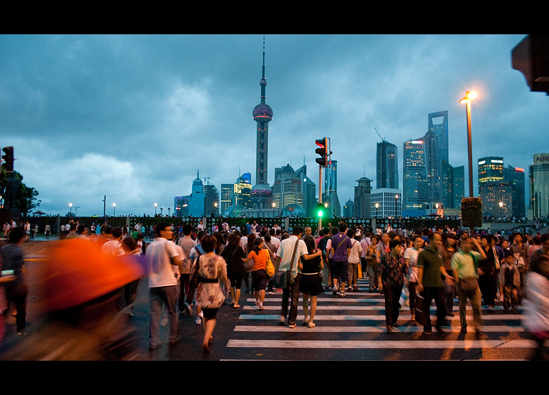
Again, another shot taken in China, specifically in Shanghai in the very dense tourist attraction of the Bund. This also has some of the same elements as the work Collin St. 5pm.
The raw file for this photo is as shown below.
The raw file for this photo is as shown below.
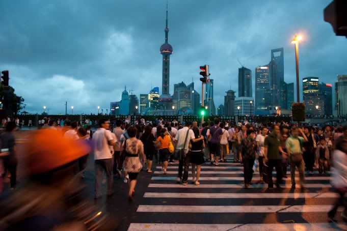
as one can see, there is not much difference between the raw and final copy.
EXIF DATA:
- Nikon D3000
- 1/10 Seconds
- f/3.5
- 18mm (Using 18-55 VR 3.5-5.6/f, VR on)
- 400 ISO
- -1/3EV
--
Adobe Lightroom 2.5
1. Autotoned (contrast and brightness increased)
2. Fill light, blacks and recovery increased
3. Cropped
Adobe Photoshop CS3
Adobe Photoshop CS3
1. Sharpened
2. Resolution and colour format changed for printing purposes
3. Borders and watermark added.
--
--
Jonathan Lim
Stand Still III
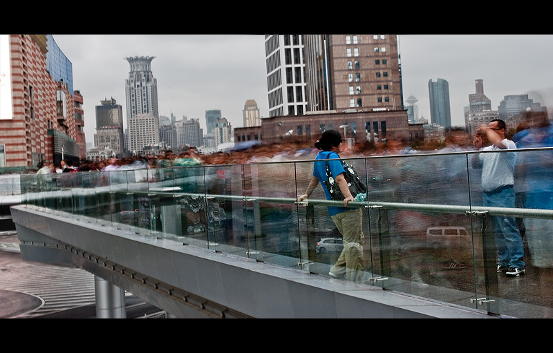
Stand still
By Jonathan Lim.
--
This shot is similar to Brack's piece as the people in this are blurred, they're unidentifiable. In this piece I have framed the unknowns in the pictures as the workers of China or in a broader sense those who are fueling the economy. This photograph was actually of people moving too and from a large shopping center.
Stand Still II
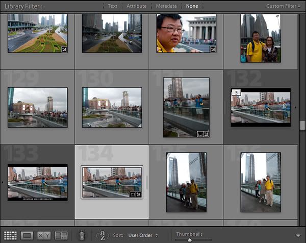
It took a number of tries to finally get what I wanted. I wanted to get one or more people sharp whilst having blur in the background through the movement of people. I had to take a number attempts because the shots had quite a long shutter speed and I did not have tripod, so it was handheld. Here's a screenshot of the series of shots taken.

Jonathan Lim

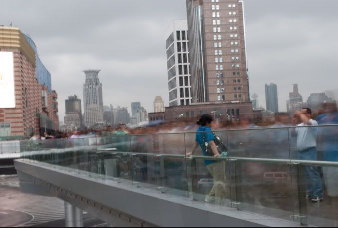
From here I chose image 134. Here is the unedited version of this photograph.

The exif data for this shot is as follows:
- Nikon D3000
- 2.5 Seconds
- f/29.0
- 35mm (Using 18-55 VR 3.5-5.6/f, VR on)
- 100 ISO
- 0EV
--
EDITS
Adobe Lightroom 2.5
1. Blacks and recovery increased
Adobe Lightroom 2.5
1. Blacks and recovery increased
2. Brightness and contrast increased
3. Fill light increased to further wide the dynamic range
4. Clarity increased
5. Vibrancy increased
6. Cropped heavily, to create a much more simplier composition
Adobe Photoshop CS3
1. Sharpened through the unsharpen mask and high pass filter.
Adobe Photoshop CS3
1. Sharpened through the unsharpen mask and high pass filter.
2. Resized to image to a3 print size (dpi, pixels & etcera)
3. Added borders.
--
After the final edits it looked like this.
3. Added borders.
--
After the final edits it looked like this.

Jonathan Lim
Stand Still I
Stand Still is a long exposure photograph inspired by great traditional artist John Brack's piece Collin St. 5PM.


This piece by Brack is very striking. The whole warm tone kinda sooths the image making it feel very monotone and somewhat simple. There's great depth in the piece created through the two layers of people, in the foreground and background.
This painting was painted during times of war, where the economy was down. It commented conformity of everyday life, with all human figures looking almost identical with one another.
This relates to my theme of the daily work routine in China. Where the economy there is booming in a scary pace, millions of people go to work to continue the rise of the communist economy. With so many people in the country just going to work, it does show what the country is developing into and it does show the everyday lives of workers in China.
Jonathan Lim
Jonathan Lim
Drag II
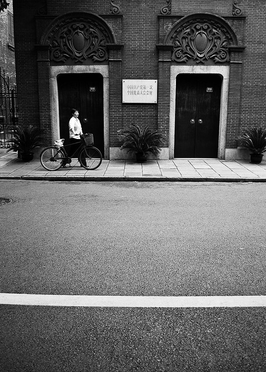
Drag
By Jonathan Lim.
An urban black and white photograph focusing on the theme of transportation. Taking on the streets of Shanghai.
Drag I
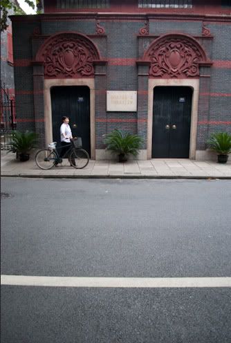
Drag is a black and white photo which kinda has quite an unique composition. The two doors, correspond with the cliche compositional rule, the rules of thirds. Whilst the bold white line runs along the bottom third of the picture, again complying with the rules of thirds. Also the main subject - which is the lady pushing the bike - is put into focus through the strong contrast between light and dark shades.
The three plants beside the doors also make reference to the rules of odds.
This shot was taken on the streets of Shanghai.
--
The RAW file of this shot is as shown below
--
EXIF Data:
--
The photograph was processed in Lightroom 2.5
1. Converted in black and white
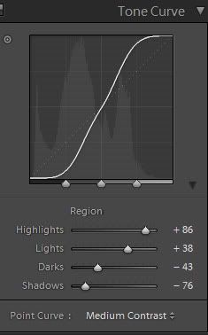
2. Curves adjusted to create more impact and contrast
3. Cropped and straightened to help the composition
4. Clarity increased
Afterwards it was just sharpened and converted to a suitable printing format in photoshop cs3.
--
I chose not to add a border to this particular photograph; mainly because it was vertical photograph. I felt that borders would have diminished the overall impact of the photograph.
--
The resulting piece can be seen:

The three plants beside the doors also make reference to the rules of odds.
This shot was taken on the streets of Shanghai.
--
The RAW file of this shot is as shown below

--
EXIF Data:
- Nikon D3000
- 1/50 Seconds
- f/3.5
- 18mm (Using 18-55 VR 3.5-5.6/f, VR on)
- 200 ISO
- -2/3EV
--
The photograph was processed in Lightroom 2.5
1. Converted in black and white
2. Curves adjusted to create more impact and contrast
3. Cropped and straightened to help the composition
4. Clarity increased
Afterwards it was just sharpened and converted to a suitable printing format in photoshop cs3.
--
I chose not to add a border to this particular photograph; mainly because it was vertical photograph. I felt that borders would have diminished the overall impact of the photograph.
--
The resulting piece can be seen:

Jonathan Lim
Restriction III
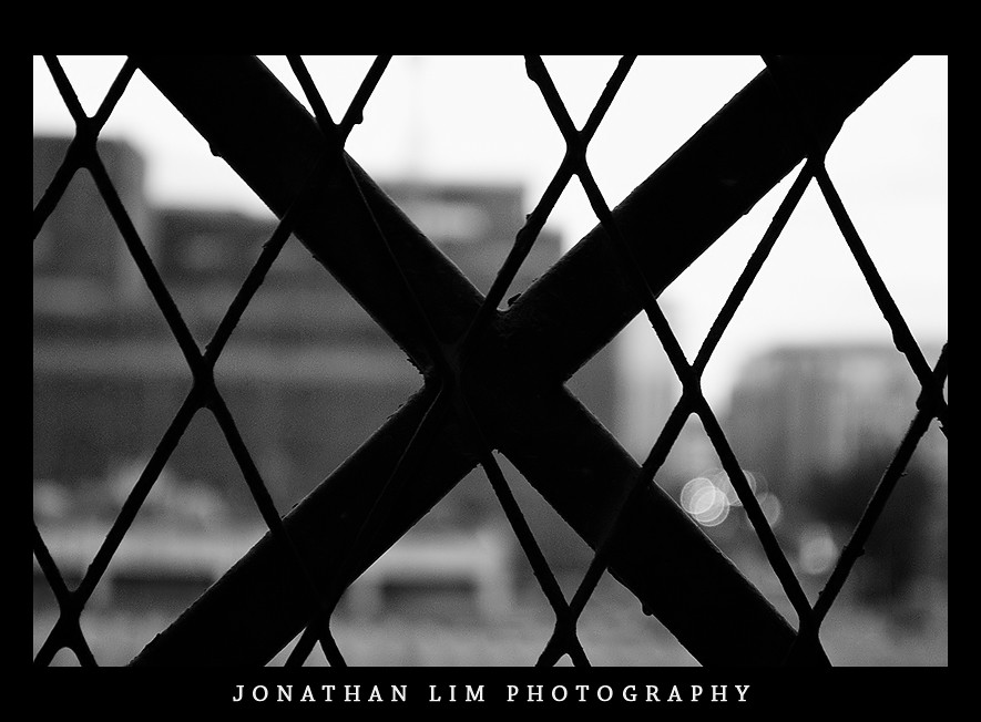
Restriction is a very conceptual piece, therefore some explanation of the concept would be significant.
Basically, Restriction is a piece that depicts the negative side of the Chinese workforce. It looks specifically at the working conditions of some workers, especially those who are caught in the trap of sweatshops.
The restriction element of this piece is created through the line structure, creating the shape 'X'. In addition to that the black and white scheme allows that element of seriousness to come about.
Overall, I am very happy with the piece. I felt that the line structure based composition is quite interesting and intriguing to the eye.
++ I love the bokeh (the circles) I felt that it really made the piece.
Jonathan Lim.
Restriction II
Restriction was taken in the hotel balcony I was staying at. I saw that there was quite an interesting line structure emerging from the balcony ledge. So, I took advantage of the moment.
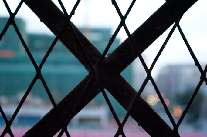
By taking the image shown below. I was quite happy with the initial outcome as I thought I composed it quite well, capturing all the lines.
The unedited shot can be seen below:
EXIF Data
I felt that the shot lacked impact and punch. That is why the following edits were made.
--
Adobe Lightroom 2.5
1. White balanced adjusted - Warmer
2. Decreased exposure
3. Increased blacks
4. Increased the vibrancy
5. Increased contrast
6. Recalibrated the shadow tint
From the edits done here, the image now looked like this:
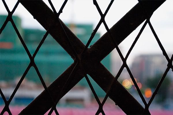
From here the image was fine tuned in photoshop.
1. Shadows/Highlights - used to increase the highlights in the piece
2. Increased the saturation whilst decreasing the lightness.
3. Converted into the grey-scale through the use of a black and white gradient map
4. Added borders and watermark
After the processing done in Photoshop, the final outcome was achieved.

By taking the image shown below. I was quite happy with the initial outcome as I thought I composed it quite well, capturing all the lines.
The unedited shot can be seen below:

EXIF Data
- Nikon D3000
- 1/13 Seconds
- f/5.6
- 55mm (Using 18-55 VR 3.5-5.6/f, VR on)
- 800 ISO
- 0EV
I felt that the shot lacked impact and punch. That is why the following edits were made.
--
Adobe Lightroom 2.5
1. White balanced adjusted - Warmer
2. Decreased exposure
3. Increased blacks
4. Increased the vibrancy
5. Increased contrast
6. Recalibrated the shadow tint
From the edits done here, the image now looked like this:

From here the image was fine tuned in photoshop.
1. Shadows/Highlights - used to increase the highlights in the piece
2. Increased the saturation whilst decreasing the lightness.
3. Converted into the grey-scale through the use of a black and white gradient map
4. Added borders and watermark
After the processing done in Photoshop, the final outcome was achieved.

Sunday, November 21, 2010
Restriction I
Restriction is an conceptual abstract photo that tries to illustrate the negative sides of the workforce in China. This is mainly referring to topics such as sweat workshops and unfair work conditions.
This shot again was inspired greatly from photographers on flickr.com .
There was one user truly inspired me when it came to abstract photography was an artist named Jeremy Walter.
Walter is a true photographer with a very unique eye for abstract shapes and line structures.
Some of his works can be shown below


As one can see from the images shown, Walter has an eye for patterns and interesting line structures. The colour in each photograph is very bold.
Deeper Issues IV
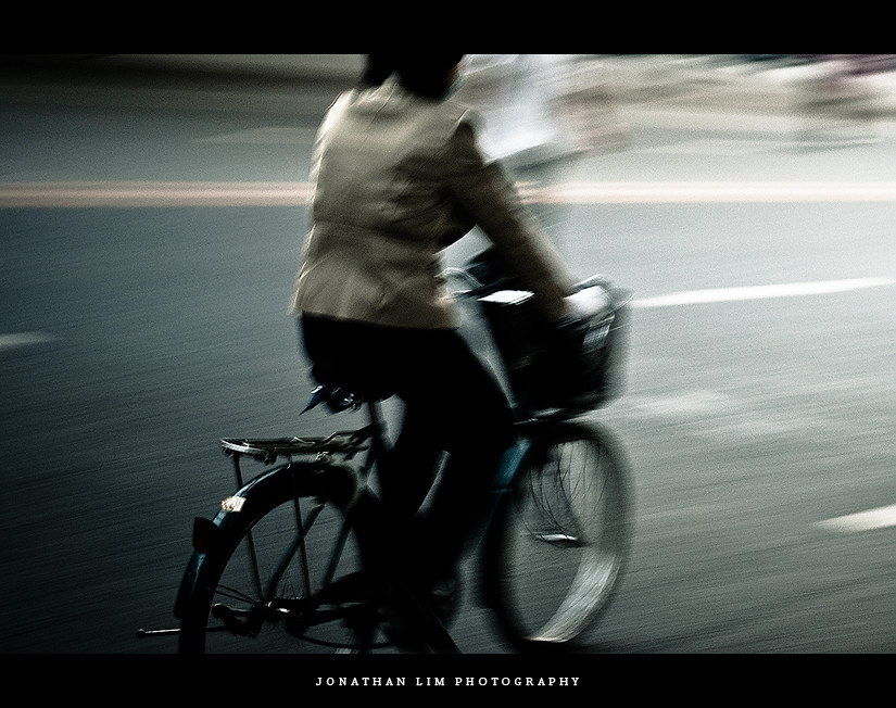
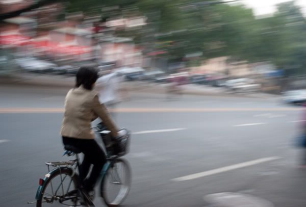
Deeper Issues is the first photo of my set of photographs that depict the Chinese workforce daily routine. It is a very dark dull start to the series but it immediately creates a striking atmosphere - serious atmosphere . But I really like this photograph. I think its composed quite well; like most of the subject is in the center of the frame but the only thing in focus is the back of the bicycle. The use of the vignette adds flow to the entire piece.
There's is lots of movement through the piece which was created through the use of panning.
Jonathan Lim.
There's is lots of movement through the piece which was created through the use of panning.
Jonathan Lim.
Deeper Issues III
Declan McGarvey
By Jonathan Lim.
An experimental emotional shot taken on the streets of Beijing.
Deeper Issues II
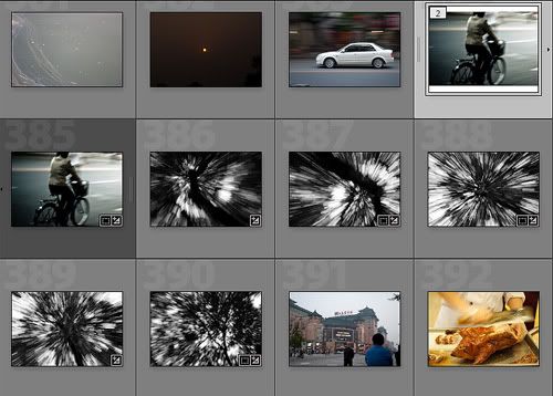
Whilst walking the streets of Shanghai, I took a number of experimental shots. One was a panning shot whilst the rest was just abstract shots. This can be seen in the screenshot below.
Shots were taken with a 18-55mm VR lens attached to a D3000 body.
1. Increased the exposure and recovery of the photo (to preserve highlights)

Shots were taken with a 18-55mm VR lens attached to a D3000 body.

All in all, I chose the experimental panning shot. The unedited version can be seen below.

This is quite a nice photo already but I really wanted to make different, and experimental.
The exif data for this shot is as follows
The exif data for this shot is as follows
- Nikon D3000
- 1/15 Seconds
- f/5.0
- 30mm (Using 18-55 VR 3.5-5.6/f, VR on)
- 200 ISO
- 0EV
From here I started editing in Adobe Lightroom 2.5.
1. Increased the exposure and recovery of the photo (to preserve highlights)
2. Increase brightness whilst decreasing contrast
3. Cropped image severly
6. Added vignette
After Lightroom adjustments, the image was moved into Adobe Photoshop Cs3.
1. Sharpened
2. Added borders
3. Resized and converted to proper printing format and size.
After photoshop and lightroom adjustments, the photograph looked like this.
After Lightroom adjustments, the image was moved into Adobe Photoshop Cs3.
1. Sharpened
2. Added borders
3. Resized and converted to proper printing format and size.
After photoshop and lightroom adjustments, the photograph looked like this.

Jonathan Lim.
Deeper Issues I
The first photograph of my set is entitled Deeper Issues. It is a very experimental photograph with a dark colour scheme.
This photograph was inspired by experimental photographers across the world wide web, particularly Dennis Smith. I found Denis Smith's works through photo sharing site flickr.com. Smith has - in my opinion - a very unique and experimental style.


As you can see from each shot, the composition is very strong. Through the strong and intelligent use of colours and shapes he is able to make the light orb appear as the main focus in the images whilst maintaining detail and proper composition in the background. This can be seen in the second photograph on the right side.
Personally, I love this unique style of his. He has very high skills in photography, which is shown by the way he maintains picture perfect exposure in all of his images without the use of editing programs.
Dennis Smith has been integral to the process of my own artworks as it teaches one to be unique and bold with their photography. In addition to that - for one to develop an individual style.
Jonathan Lim.
This photograph was inspired by experimental photographers across the world wide web, particularly Dennis Smith. I found Denis Smith's works through photo sharing site flickr.com. Smith has - in my opinion - a very unique and experimental style.
In all his works it features at least one light orb. Most of them are very simplistic in terms of composition, but simplicity most of the time is key. The pieces are unique as the light orb is exposed perfectly in the environment it is created in, he insists that there was no editing to the image, which therefore raises questions just how does he do it?

This photograph makes strong use of colours, using contrasting colours to create interest to the eye.


As you can see from each shot, the composition is very strong. Through the strong and intelligent use of colours and shapes he is able to make the light orb appear as the main focus in the images whilst maintaining detail and proper composition in the background. This can be seen in the second photograph on the right side.
Personally, I love this unique style of his. He has very high skills in photography, which is shown by the way he maintains picture perfect exposure in all of his images without the use of editing programs.
Dennis Smith has been integral to the process of my own artworks as it teaches one to be unique and bold with their photography. In addition to that - for one to develop an individual style.
Jonathan Lim.
Selection + Order
From looking at an enormous amount of photographs, I have chosen the photographs that I wish to present as a set for this unit entitled 'cycles'. I have chosen a total of six photographs. Each photograph has been positioned precisely within the order, to create flow in my overall set. It the start it has a couple of day time cycling photos which are somewhat more expressive and conceptual compared to a few photographs in the set. Then a conceptual abstract is next. With that a transition from black and white photographs can be seen with the next half of photos presenting more themes of transportation/movement/business in colour.

Deeper Issues

Drag

X - Restriction

Stand Still

Movement

Stop Start Ending
\Here's a general link of all the photographs above: http://www.flickr.com/photos/glimjo/sets/72157625222012975/
Jonathan Lim.
Subscribe to:
Comments (Atom)
