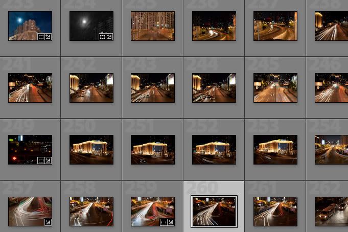
Here's a screenshot of some of the shots taken.

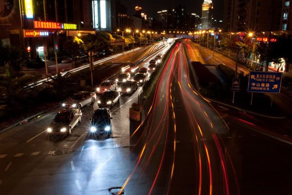
From here I chose the following RAW shot below. I liked this shot because it was different to the other shots that I took on that night. It displays both stillness and movement, thus creating an interesting composition.

As much as already did love this photo, I felt that it could be improved. The blue lights imo were very distracting and disrupted the whole ambience of the photograph.
EXIF DATA:
Nikon D3000
15 Seconds
f/20
18mm (Using 18-55 VR 3.5-5.6/f, VR off)
100 ISO
0EV
EXIF DATA:
Nikon D3000
15 Seconds
f/20
18mm (Using 18-55 VR 3.5-5.6/f, VR off)
100 ISO
0EV
--
Adobe Lightroom 2.5
1. Cropped the image + straightned
2. Decreased the saturation of the blues in photoshop
3. Increased highlight recovery
4. Increased the vibrancy
5. Increased the fill light whilst decreasing the exposure
6. Change the colour balance, making the image much warmer.
After the edits in Lightroom the image now looked like this:

When I put it in photoshop, I still felt that the blue-ish area was still to prominent.
Adobe Photoshop CS3
1. Cloned out blown out highlights from some of the store signs on edge of frame.
Adobe Photoshop CS3
1. Cloned out blown out highlights from some of the store signs on edge of frame.
2. Used a selective colour adjustment layer to change the colour of the blues - masked
3. Desaturated the blue area using a Hue/saturation adjustment layer. - masked
4. Used a colour balance layer which was layer masked to match the desaturated area with the temperature of the photograph.
5. Added a black and white gradient map on luminosity to create more impact
6. Added a border and watermark
6. Added a border and watermark
7. Resized image and change colour space for proper printing format.
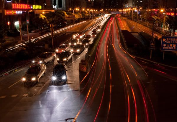
After the edits in Photoshop, the resulting image is as shown below:

Jonathan Lim
No comments:
Post a Comment