Sunday, September 11, 2011

Reflection I

Overall, I am very pleased with the artworks that I have produced. I felt that each and every artwork was composed very well, ensuring that there was no sense of discord or lack of flow.

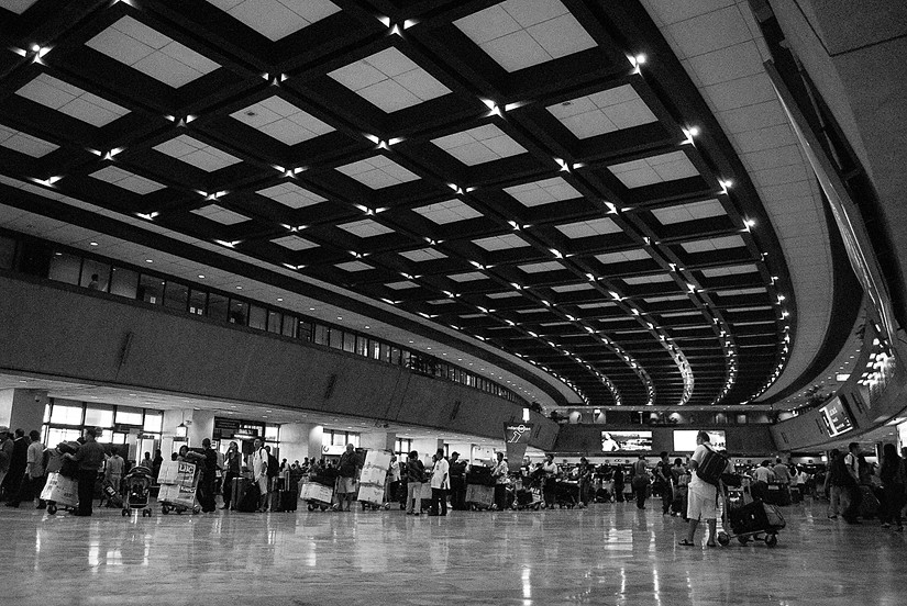
My favourite photographs were probably the first and second last.

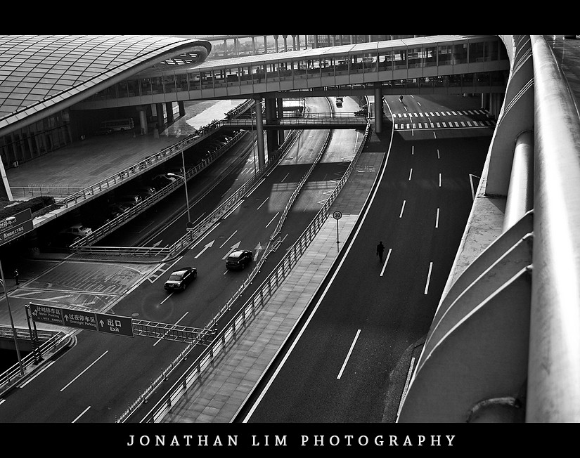
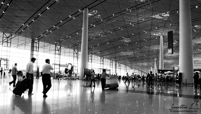
I loved the first because of composition, the strong curve line crossing the photograph into the a vanishing point. There is emphasis on the two business men to the left, who are glorified through the overexposed lighting behind them. I felt that this airport terminal shot gave a very strong sense of journey, going from one destination to another.


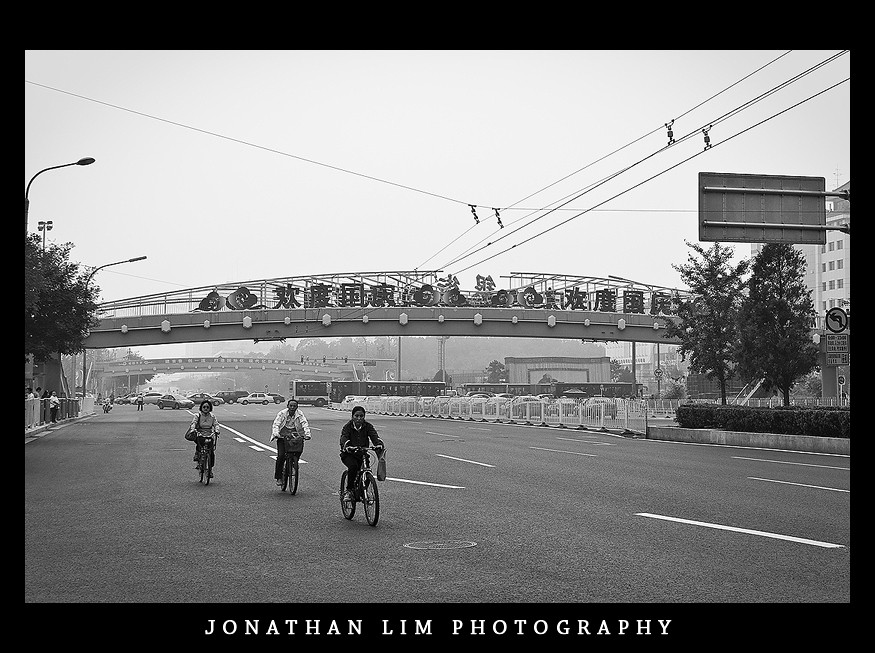
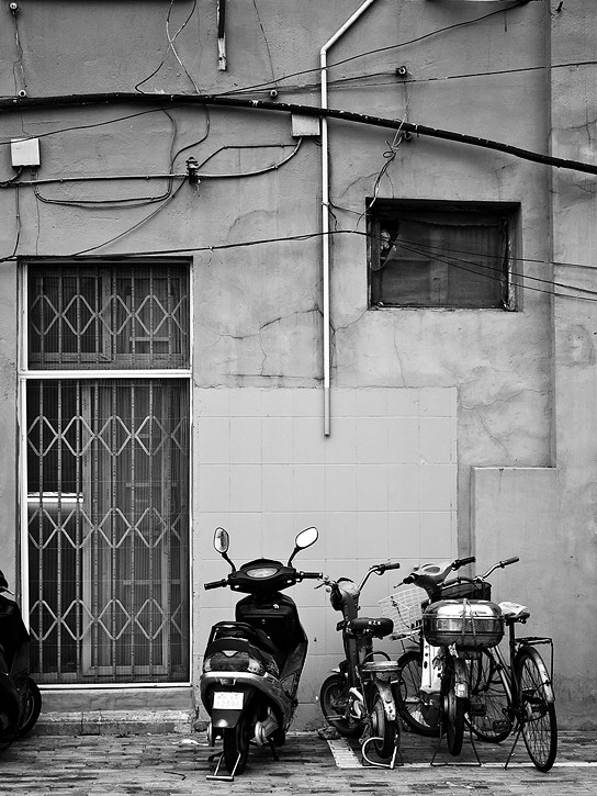
I liked the above photograph because its composition using lines and shapes. The various shapes and lines direct the viewers eye around the work. this gives a strong sense of journey because it represents the end point a journey, which is signified through bikes and motorcycles.

Again, the literal interpretation of journey shine once again. Despite, having quite a messy composition with many things going on, we are still able to focus on the subject to bottom right, whom we assume is on the start/end of a travel journey.
The Start of a Journey


The Start of a Journey
By Jonathan Lim

The following series of photographs reflects my personal and literal interpretation of the notion, journey. By compiling a series of simple clean photographs from various modes of transport, journey is reflected as going from one place to another. This was created through strong use of lines and perspective to achieve depth. This series of photographs are inspired by a number of photostreams on flickr, whoever, the photographer that influenced these works the most was Patrick Wally's journey collection featuring three over-exposed photographs (http://8th-atomos.blogspot.com/2011/09/inspiration-iii-patrick-wally-journey.html). The use of redscale brings something new to the photography scene, where there was only coloured and monotone.


Greyscale II - Before and After

1.


The image was then brought to photoshop. A BW gradient map was applied in the overlay layer setting and exposure adjustment layer was used to increase the darks and midtones slightly.


2.


The final version does not have a border and watermark.


3.


4.


5.


Greyscale I


Saturday, September 10, 2011

Redscale III - Before and After

1.


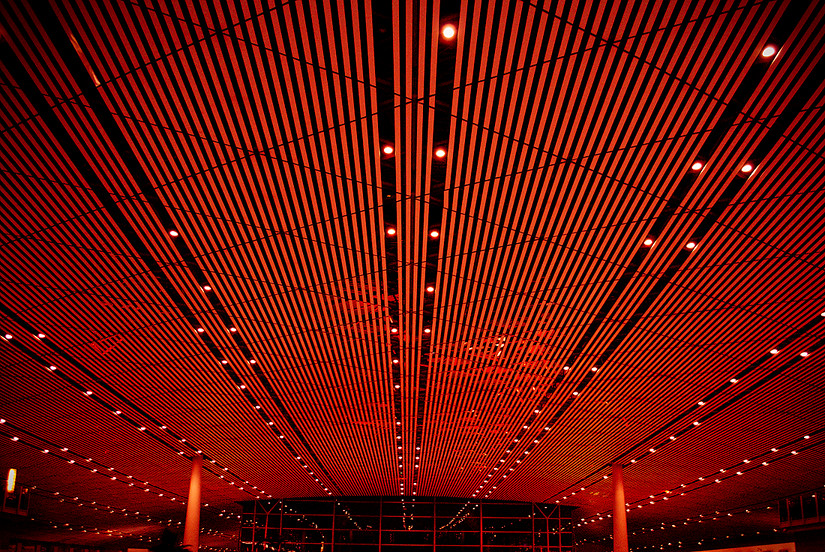
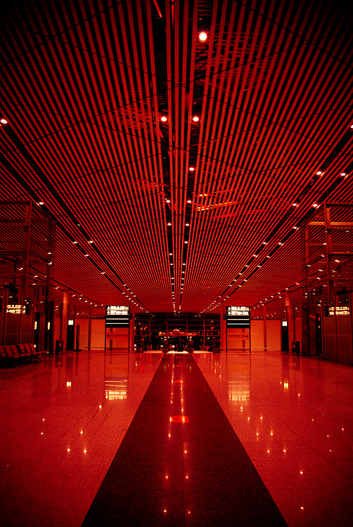
I felt the composition in the before image was very messy with too many elements competing for focus. That it why I simplified the piece, focussing on one area of the initial photograph - the intricate line structures on the roof.


I'm very happy with the outcome. The lines give a strong sense of direction towards the bottom of the page signifying a destination out of the building bounds.

2.


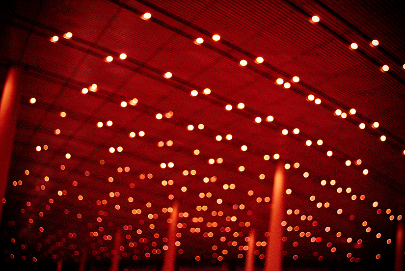
Using the technique of purposely blurring a photograph worked very well in this photograph because of the bokeh from the lights  emerging. The changed in density of the stars and the burned bottom of the photograph creates depth and flow.

3.


There was no changes made on the photograph except for the 'redscale' adjustments. However, I did notice that there was a small degree of camera shake in this photograph hindering the sharpness.


Despite the motion blur affecting the overall merit of the photograph, composition wise, it is well composed with lines at the top and bottom of the piece moving towards the rectangle shaped windows.


4.


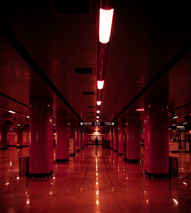
As it can be seen, extreme cropping took place. Isolating and creating focus for the subject in the middle through the rhythm created by line structures and shapes.


This is probably my favourite photo from the red-scale set. The silhouette of the man walking directly in the middle of piece creates a strong aesthetic. It's placed into focus through four main line structures: the two black lines coming from each top corner of the piece, the line from the lights on the roof and the line created by the roof reflection on the floor.

5.


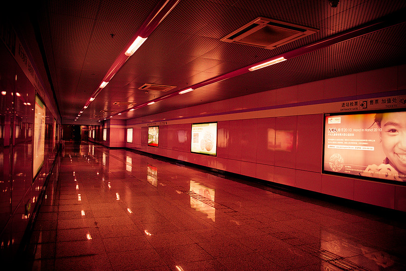
After the redscale preset was applied the fill lights and and recovery were increased dramatically to improve the exposure of the photograph.


The composition carried out in this photograph different to the other's in the set as it doesn't have a balanced feel. The piece directs one's eye from the right side of the piece to the left. This constantly repeats.

Redscale II - Primary Post Processing changes.

All images in this part have all been applied with a lightroom pre-set entitled 'redscale.' Major global adjustments have been placed below in screen shots.


^^This was to add more contrast^^


The split toning adjustment is the most important element in this group as it controls the tone/filter of the photograph.

A vignette was also applied in Lightroom, this was carefully managed to ensure that the effect was not overdone.

Each photograph is sharpened in Adobe Photoshop CS3 either using the sharpen filter or by creating a new layer applied with a merged copy of the image, filtered with a Filter>Other>High Pass --> Layer then set to overlay with opacity reduced suitably for each photo.

The next post will look at the before and after of each photograph, as well as addressing the individual changes made.

Redscale I

Redscale is an experimental colour scheme that I developed through the use of Adobe Lightroom 2.5. Similar to black and white photos, the colour scheme is monotone. In redscale, it's obviously red.

here are the five photographs that make up this group. The next post will show the processing done to each photograph to achieve the final outcomes below.


The first three artworks were taken in an airport terminal and the last two were taken in a train station.

In all the images below except for one, there is strong use of lines and perspective to create the illusion of depth.