As it can be seen.
All of the photographs in the previous post all have their own distinctive line structure.
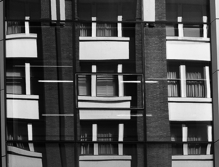
The first one, which is black and white has a number of vertical, horizontal and diagonal lines. However, the most important part of this image is the contrast in the center of the piece, it creates rhythm and stops the photo from becoming static/flat.
The second photograph is created through mirror reflection of another building. The geometric shapes mixed with the vivid colours of the windows and building colours - created possibly through photo manipulation - makes the artwork very appealing.
The third photograph is very powerful despite its monotonous blue tint. The contrast between the light and dark along with the central line in the middle really create a strong sense of depth. Again, a strong line pattern can be seen on the building. A geometric feeling is created through the pinicale of this piece.
The fourth photograph uses curved lines, repetition and colours to spark appeal. The strong use of curve lines incites dynamic flow and rhythm.
Jonathan Lim